Portfolio Information
- Date: September 2018 (Round 2)
- Skills: UI, UX, IA, Research
- Client: Budget Me Pretty
PROJECT OVERVIEW
Wanting to incorporate an interest of mine with my UX skills, I worked on creating Budget Me Pretty, a mobile budgeting app for those who are planning weddings. While there are many budgeting apps out there and even web-based wedding budgeting apps, there is a gap for a mobile budgeting app.
The app works to first discover a bit more about the wedding the couple is planning and based on what it learns it makes recommendations for what the couple should budget for each different type of vendor. Also, there is functionality to add information about when you booked, when you paid, who you paid it to, who the point of contact is, if there was a retainer/deposit, and if there are upcoming payments needing to be made.
THE PROBLEM
Budget Me Pretty solves the fact that there are no mobile wedding budgeting apps. Web-based wedding budgeting apps are great but most couples do not take their computers to vendor meetings, venue walk throughs, food tastings, and more. It’s significantly more convenient and practical to have this as a mobile app.
THE CUSTOMER EXPERIENCE
It’s important that users 1) can input their total budget, 2) can input any costs they’ve already paid for – since they may start using the app midway through planning, 3) can keep information organized with their vendor infomation, and 4) see recommendations for how much they should budget for all the vendors/services they hope to book.
THE SOLUTION
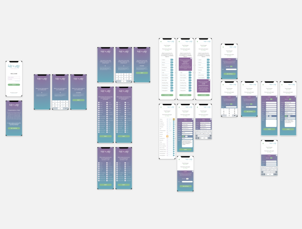
The mobile-first Budget Me Pretty app allows those planning weddings to get a full view into their wedding budgeting constraints. They can add notes on their vendors, see both percentages and dollar amounts for how much they should spend on different categories, and keep it all in their back pocket.
MY ROLE
UI/UX Designer (Personal Project)
TOOLS USED
Pen + Paper (Sketching/idea generation), Balsamiq (low-fidelity wireframes), Sketch (high-fidelity wireframes, final prototype), InVision (first draft prototype).
RESEARCH AND DISCOVERY
Initial Research
In order to familiarize myself with wedding budgeting, I first turned to some people I work very closely with – my wedding photography clients. They expressed a need for a mobile budgeting calculator because the current budgeting systems they use on their mobile devices aren’t specifically for weddings. They mention that they started using web based ones, but didn’t continue using it because it was on their computer.
I studied mobile budgeting apps such as Mint, Spending Tracker, Budget, and YNAB. I also studied web browser based wedding budgeting apps on Wedding Wire and The Knot. This researched helped me understand best practices and assisted in my understanding of needs to be considered when budgeting for a wedding!
Conducting Interviews
In order to learn more about what users and potential users wanted in a wedding budgeting app, I conducted interviews with 5 couples who were planning their weddings. *Note: these 5 couples were all close to me in a sense that they were my photography clients. It’s possible that they mentioned/did not mention certain things about their budget because of the fact that I’d be a part of their wedding spending.
Questions
- Do you use any budgeting apps on your phone?
- How do you use the budgeting apps?
- Do you use any wedding budgeting apps on your phone?
- How do you use it?
- Do you prefer web browser apps or phone apps?
- How are you currently budgeting for your wedding?
- Do you know the industry trends for how much money to spend on various aspects of your wedding?
- How are you keeping organized for your wedding?
Findings
- Couples want to track their budget for their wedding.
- They don’t necessarily know what percent of their budget should go to what, but they are interested in learning.
- They prefer phone apps – “it seems more like a calculator that retains calculations.”
- Keeping organized is important and they mostly try to do that through their email inbox and excel.
[aigpl-gallery grid=”5 ” gallery_height=”200″ id=”2383″]
EARLY IDEAS
After sketching out a few ideas on paper and creating an initial user flow, I created some mock ups using Balsamiq to get ideas to be a bit more thorough. The first draft of the app was quite simple and was based on 3 main screens with buttons that have slide up screen overlays. The idea was that couples would set their budget, then be able to see what vendors/items they’ve already contracted or purchased and how much they spent on that, and then be able to see what vendors they still needed (and how much they have left to spend on it). They’d have the flexibility to add any information to the vendor information, add additional vendors to the vendors needed page, and edit the budget.
[aigpl-gallery grid=”5 ” gallery_height=”200″ id=”2384″]
FIRST DRAFT DESIGN
While the main issue I wanted to solve was that there really isn’t a good app for wedding budgeting, I also wanted this to be more than just a budgeting app. I wanted it to give couples the ability and flexibility to control what vendors are important to them, add information about the vendor (such as what package they booked or what color plates they’re buying), and to not feel overly heavy. I tested out the design on a few couples and they gave me feedback. After minor tweaks were made, I created the final design and prototype in Sketch.
[aigpl-gallery grid=”5 ” gallery_height=”200″ id=”2385″]
EVALUATE & FINAL DESIGN
After doing a few rounds of user testing, I heavily revised the app into the final design. In order to make it more user friendly and have a better user flow, I redesigned almost every screen and feature. During the redesign, I kept a lot of similar elements – buttons and colors – but I made more cues, consistent symbols, and better overlays.
I see this app developing further into something a bit more complex (but still easy to use) in the future. There are a lot of capabilities that I did not include in the first go around, for simplicity sake and to see if this was even a good idea.
